web design
Esta clinic
Description
Dental clinic "Esta" provides the highest level of treatment from the best dentists in Moscow. The qualifications and experience of dentists and surgeons allow to perform the most complex procedures and operations.
The project had started 3 months before I joined the team. I was hired as a designer to improve the user experience and redesign UI. Worked on various types of challenges closely with developers, copywriter, co-founder, and product manager.
Problem
The target audience of the site is divided into two groups: new clients and existing ones. To satisfy both types of clients, it was important to present the information clearly, highlight the benefits and show more about daily life in the clinic.
We had to minimize the errors in the application form. Most of the users were putting wrong phone numbers and because of that, the clinic was losing clients.
We have to catch and keep attention in the first 3 seconds of visiting the site.
Solution
The solution was to add a block with the CEO message as a quote and his photo to increase the customer trust (see the example below)
Moreover, we added an auto mask with a country code, that automatically verified the country where the user is located.
The solution was to embed a video about the clinic on the first screen.
Role: UX/UI Designer
Tools: Adobe Photoshop
Client: Esta clinic
Year: 2019 - 2021
Tools: Adobe Photoshop
Client: Esta clinic
Year: 2019 - 2021
https://esta-clinic.ru/
Process
Although no design process is as perfect as we'd like. We can roughly define the process in the following 5 steps. In the sections below, we'll go into more detail about each step and how we came to the final solution.
Desk research
Customer feedback
Customer feedback
Empathize
Identify needs
Establish principles
Establish principles
Define
Task flows
Lo-Fi Sketches
Lo-Fi Sketches
Ideate
Hi-Fi mockups
User testing
Copy localization
User testing
Copy localization
Prototype
Launch tests on live
customers and evalute
results
customers and evalute
results
Test
Empathize
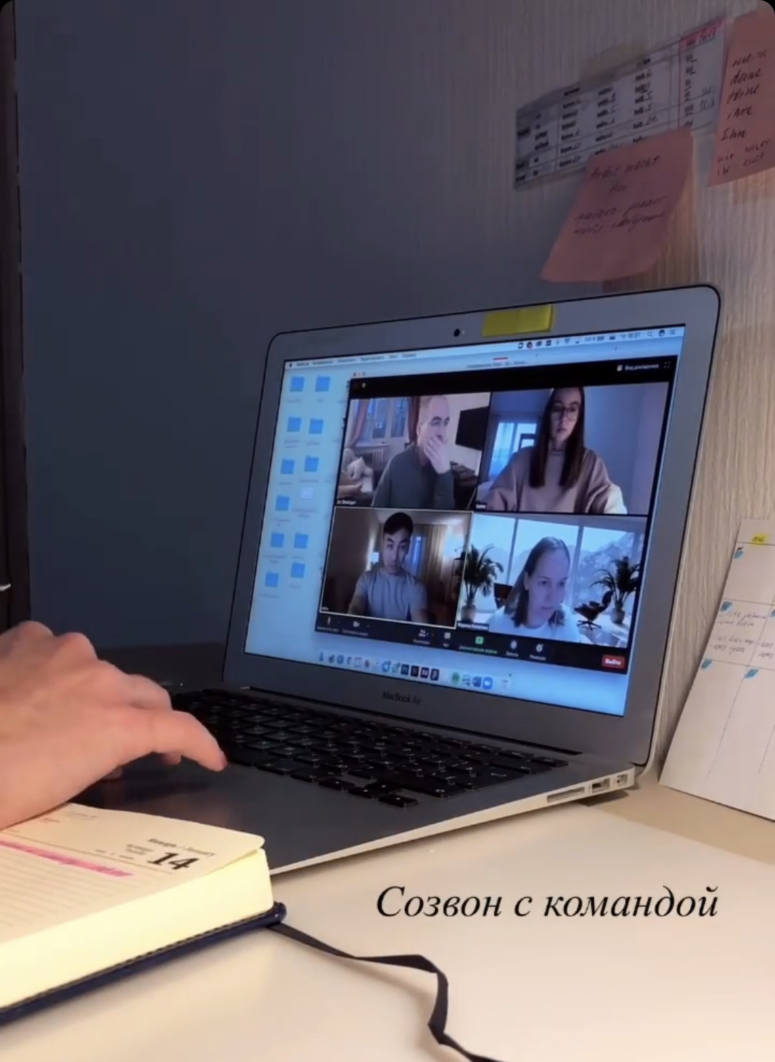
We looked into what already existed before I joined the project and aimed for a better understanding of what our customers were currently doing and why.
types of research
We looked at many different points of data — both qualitative and quantitative from internal sources, and qualitative from external sources.
types of research
We looked at many different points of data — both qualitative and quantitative from internal sources, and qualitative from external sources.
phase 1
1
// Usage data
2
// User feedback
3
// Comparative analysis
internal
external
// Usage data
We had two data resources to work with. Data from Google analytics and Yandex metrics from the marketer. Data from the administrator who received oral feedback from the patients. Since most of the data coming from metrics and administrator were about the main page, we decided to focus on that first.
// User feedback
From the marketer, it turned out that users have errors when entering a phone number in the application.
We learned from the clients that information about doctors and the personal appeal of the CEO inspires more confidence when booking an appointment. They also indicated that they would like to see more of the real life of the clinic on the site.
We learned from the clients that information about doctors and the personal appeal of the CEO inspires more confidence when booking an appointment. They also indicated that they would like to see more of the real life of the clinic on the site.
// Comparative analysis
After analyzing competitors, we realized that a video about the clinic on the first screen has a better effect on conversion.
Define
We decided to test the new layout of blocks with information about dentists. Moreover, we added a block with the clinic's Instagram and a block with photos. Tested a new feature in the booking an appointment form.
phase 2
We ran a workshop to expand the ideas of each of us and consult with the developers. The marketer suggested adding a block with FAQ. And I proposed to make cards with questions, by clicking on which, there will be a redirect to a landing page with a service.
// COLLABORATIVE IDEATION
Ideate
We worked through several different iterations and user flows to see what might be the most meaningful user journey for the purpose of this test.
phase 3
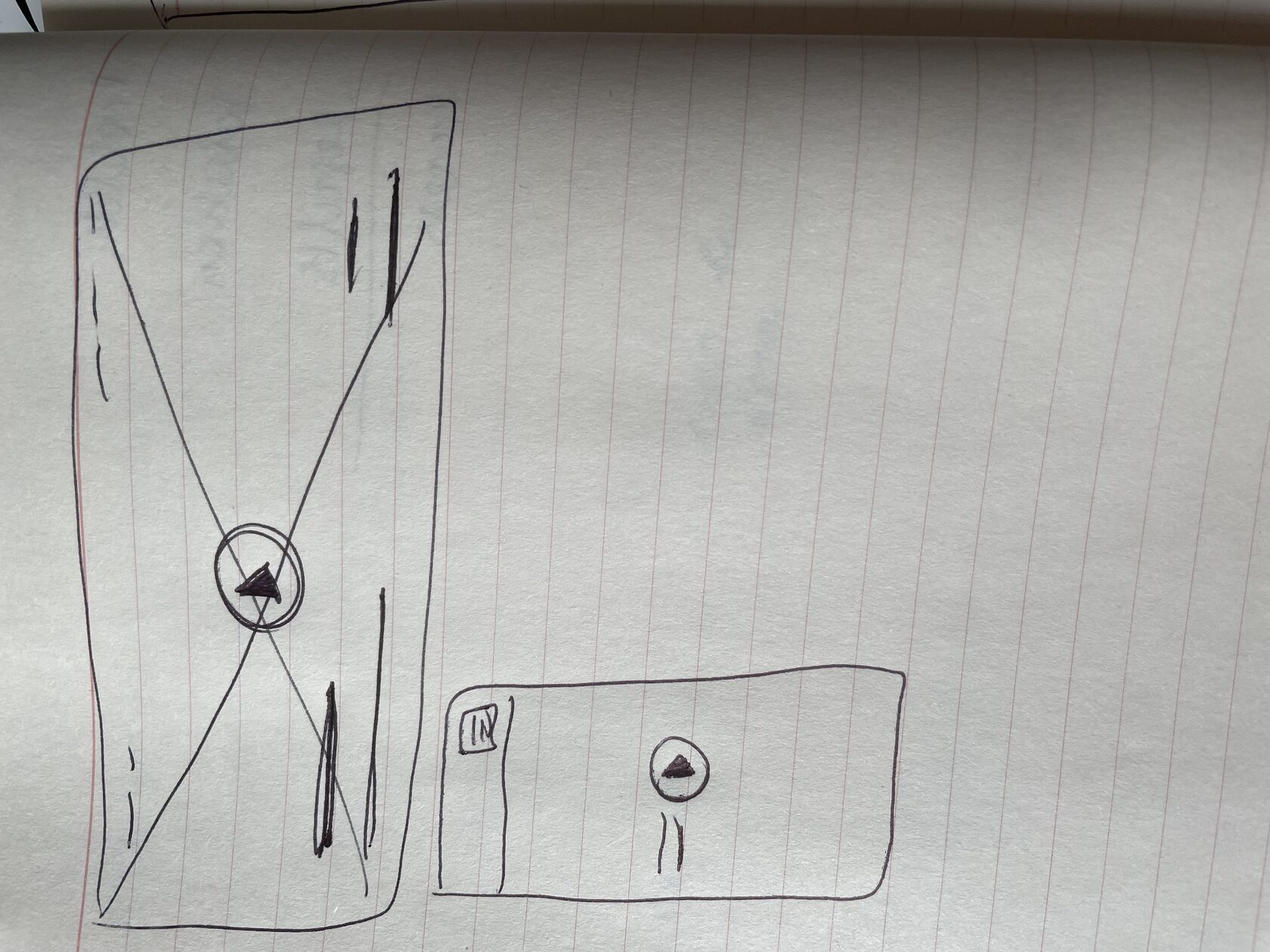
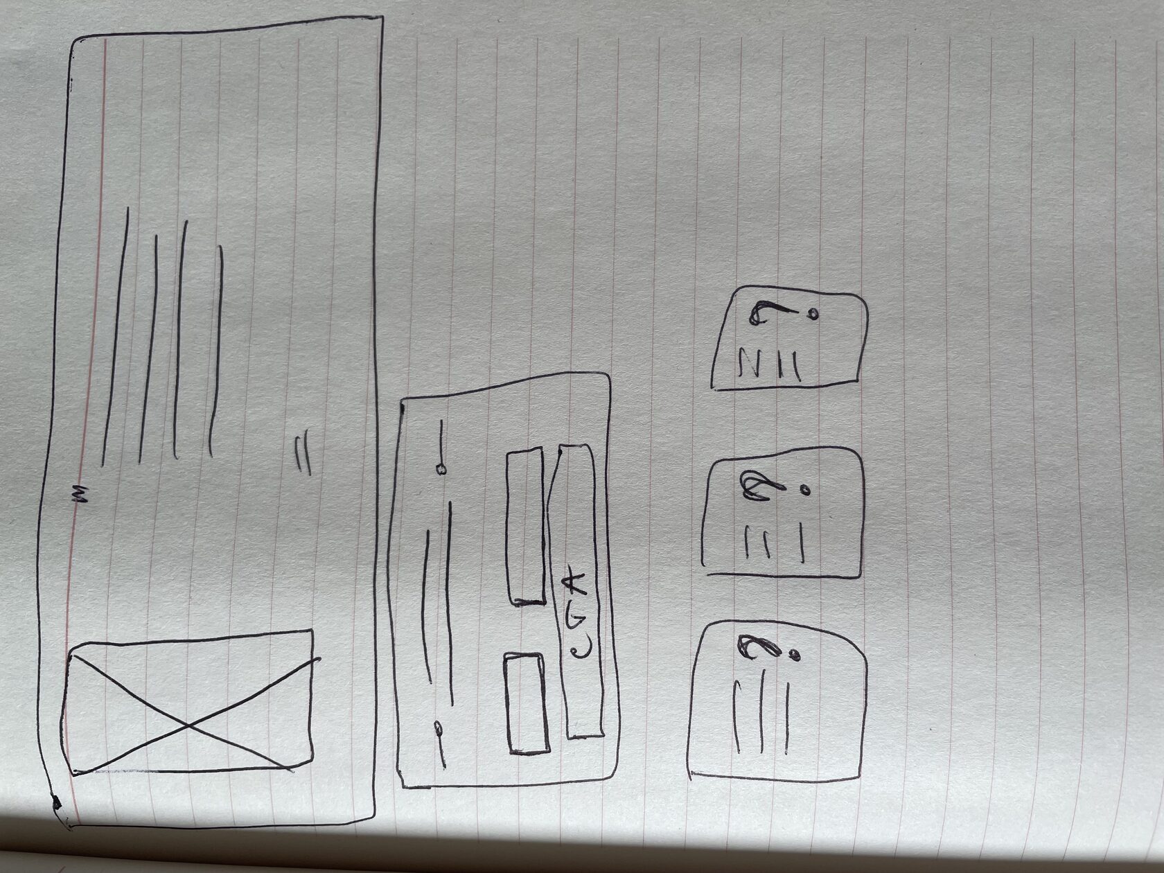
Based on the information we gathered in the workshops, we got to work on various wireframes both from a structural and an interaction perspective.
// USER FLOWS & WIREFRAME EXPLORATIONS
From testing to final idea
I want to show the result of changes that came after testing. And how this changes reflected the conversion.
phase 4
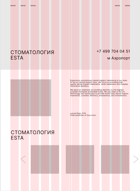
We added a video block about the clinic located on the first screen. The results of the test showed us that the new user's attention increased and they continued scrolling to the next blocks.
// First block
Click the arrow to see new/old version
Because of the feedback that "CEO inspires more confidence when booking an appointment" we decided to add a photo of the CEO next to his speech instead of having just the quote.
// Quote
Click the arrow to see old/new version
✅
✅
Due to the fact that users were entering incorrect phone numbers, we decided to change the form. Added a function with a mask that automatically splits a phone number using dashes and auto-detects the correct length of it based on the code country. Thus, the amount of errors in the application were reduced.
We also added the ability to write directly in the WhatsApp, highlighting the name of the messenger in the corporate color. What increased the number of applications directly.
We also added the ability to write directly in the WhatsApp, highlighting the name of the messenger in the corporate color. What increased the number of applications directly.
// Application form
Click the arrow to see new/old version
✅
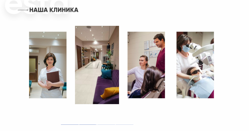
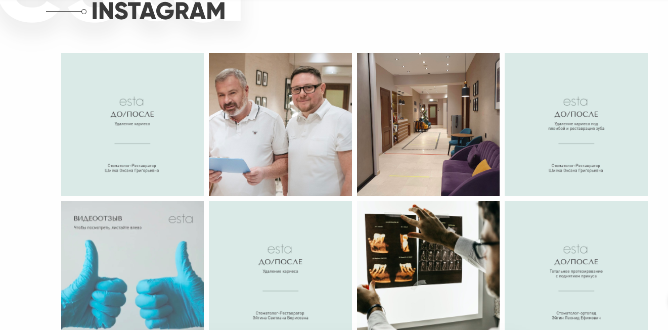
To immerse a user in the atmosphere of the clinic, we have added two blocks:
1. Real photos of doctors, treatment process and clinic photos
2. Instagram, where anyone can follow the work of the clinic in real time. Also, this feature allows to direct the traffic from website to Instagram and increase the amount of followers.
1. Real photos of doctors, treatment process and clinic photos
2. Instagram, where anyone can follow the work of the clinic in real time. Also, this feature allows to direct the traffic from website to Instagram and increase the amount of followers.
// Adding life content
✅
We decided to do FAQ cards, by clicking on which, the user will be redirected to the secondary page of the website. There will be a response to the question and further information on the service.
We were testing this idea during one month. The marketer looked into data and the clickbait rate for these questions was minimal. We decided to put this block on the top of the website to short the time route of the user to this block. However, different location of the block didn't solve the problem. Therefore, this block did not pass the test and we removed it.
We were testing this idea during one month. The marketer looked into data and the clickbait rate for these questions was minimal. We decided to put this block on the top of the website to short the time route of the user to this block. However, different location of the block didn't solve the problem. Therefore, this block did not pass the test and we removed it.
// Idea that failed testing
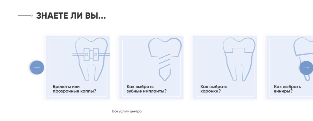
❌
Results in numbers
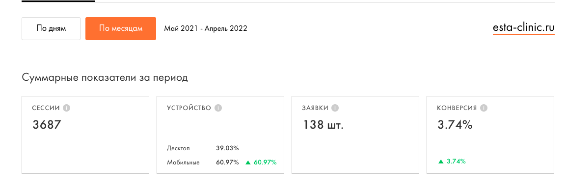
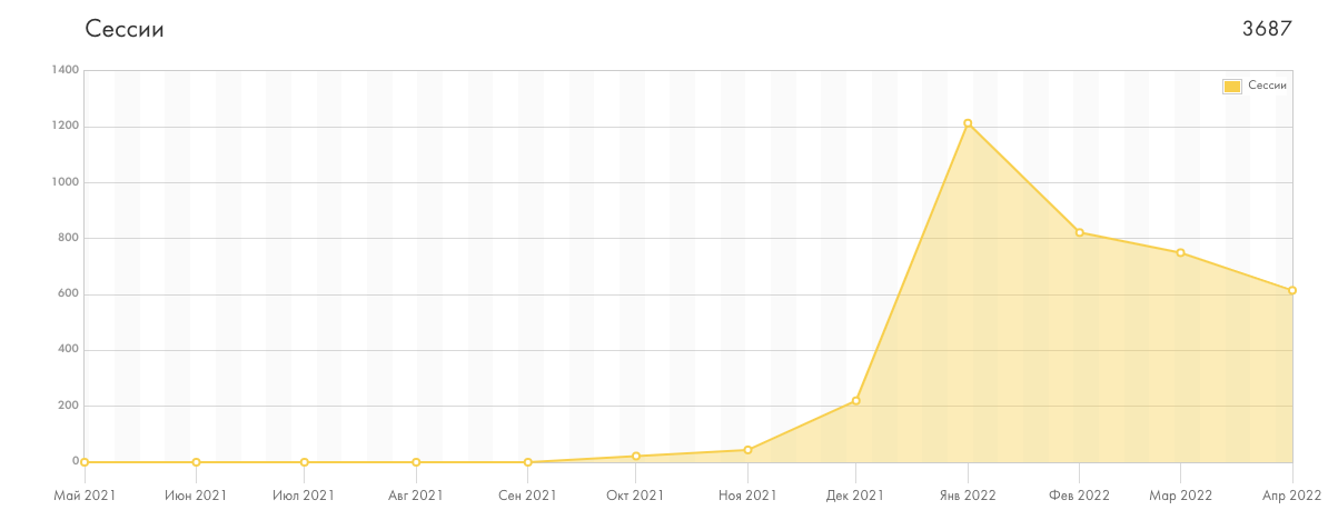
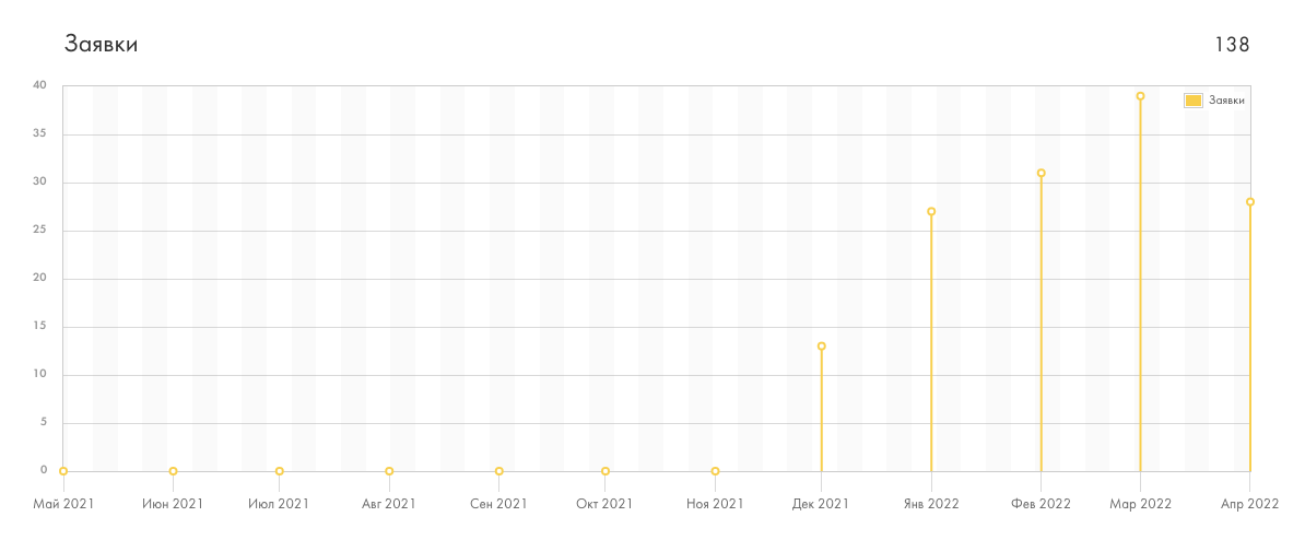
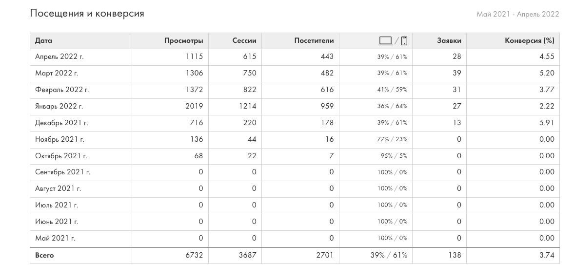
all this numbers are for the period may 2021-april 2022
sessions
device
application
conversion
sessions
users
application
conversion
website views
sessions
application
contact
! By the way I have a work permit in the Czech Republic
