web design
HMI design
Description
Design a digital cluster for the car that will come in production in five years.
According to the small research I should make sketches of the driver's screen. And also make wireframes of the layout, keeping in attention the information hierarchy.
Design a digital cluster for the car that will come in production in five years.
According to the small research I should make sketches of the driver's screen. And also make wireframes of the layout, keeping in attention the information hierarchy.
Role: UX Designer
Tools: Figma
Client: NDA
Year: 2022
Tools: Figma
Client: NDA
Year: 2022
Process
Started with the small research to explore the latest trends and basic information.

// What is a digital cluster for a car?
It's not a control panel for driver
It's an area to focus while driving
It's an area to focus while driving
// How can we understand what information in particular environment is necessary?
For the purpose of this being brief, I will focus on young people only.
It would be fantastic if every manufacturer had an optional setting to simplify the display. 90% of the information displayed is not necessary.
I used to drive VW Beetles, they have a very simple combination gauge display. Speed, fuel gauge and odometer in one round gauge, with warning lights for critical functions. You don't need to know anything else.
I would like to have one button which gives a full-screen digital speedometer and nothing else. Indicators or warning lights can light up as required, but if nothing else is happening, simply show the speed.
Digital clusters solve the problem of presenting only needed information through flexible software.
Not everything has to be shown at the same time, and a particular type of information can be prioritised depending on the driving situation.
Not everything has to be shown at the same time, and a particular type of information can be prioritised depending on the driving situation.
1st answer
"For example, if a driver is using adaptive cruise control, visualization of the car centered within its lane can be displayed, alongside vehicles in adjacent lanes."
2nd answer
During the discussion in comments about this feature, people were separated in two groups.
+ It is useful thing because:
"not every car has perfect side and rear visibility, and therefore visualisations give you a better context and situational awareness of your driving environment"
"useful feature to have just to double check your blind sports"
"not every car has perfect side and rear visibility, and therefore visualisations give you a better context and situational awareness of your driving environment"
"useful feature to have just to double check your blind sports"
- Useless thing because:
"Really? You need a 'visualisation of the car centred in its lane' to tell you if the car's centred in its lane? I've always found the windscreen was pretty good for that." (LOL, hope you'll smile a little bit as I did)
"Really? You need a 'visualisation of the car centred in its lane' to tell you if the car's centred in its lane? I've always found the windscreen was pretty good for that." (LOL, hope you'll smile a little bit as I did)
"In another scenario, if the driver is in a difficult-to-navigate location such as a complex junction, the instrument cluster can be used to display a full map view."
3d answer
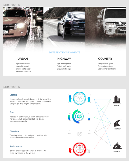
Focus in design on different driving modes that filter the information according to the driving scenario.
conclusion
"According to the different environment (Urban, Country, Highway and Stationary) the user can choose the feature that allows console automatically adapt to the environment.
The highway, urban and city modes are engaged automatically by the system.
The stationary mode is engaged when the car is in park or neutral.
The highway, urban and city modes are engaged automatically by the system.
The stationary mode is engaged when the car is in park or neutral.
// Concept Explanation
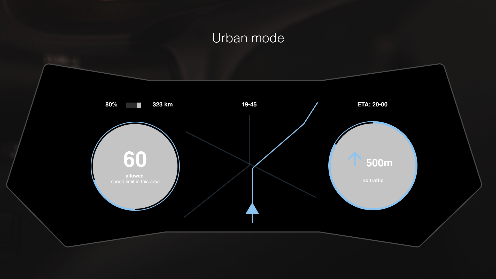
urban mode
When the user enters a city, the UI changes the display of information accordingly. In the center is navigating through complicated streets. On the left side there is a speedometer that shows current speed. Also user can see the announcement what maximum speed is allowed in the area of driving (if the speed limit is exceeded, the ring around the speedometer changes the color and the allowed speed will appear under the current speed). The area that filled around the speedometer shows the current speed instead of a basic speedometer needle.
The map shows a detailed top view of the city with the route projected on top of it.
On the right side user can see the information about the navigation and the information about the traffic status in the current period of time. The area that filled around with the color shows how much of the route left to the final destination. ETA is the estimated time of arrival.
1st
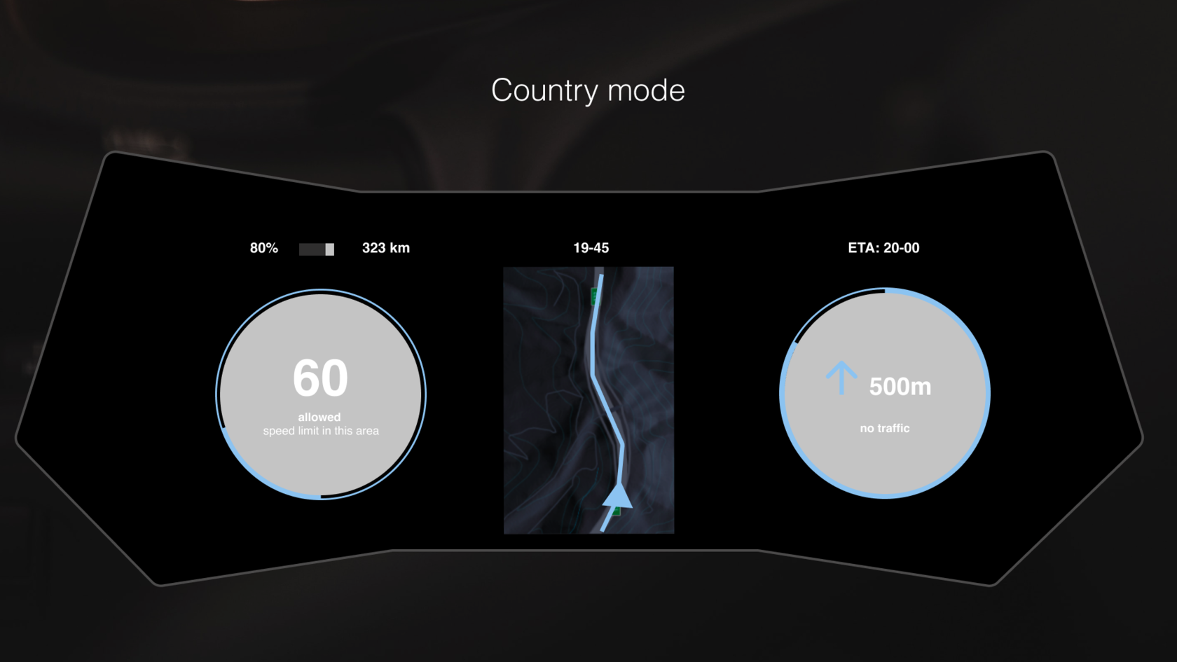
country mode
Difference:
When the driver enters a countryside, the UI changes the display of information accordingly. In the center is navigating through streets and main road conditions. Main road conditions included announcement for the user about the type of the road.
The map shows a detailed top view of the highways or countryside with the route projected on top of it.
Similarity:
On the left side there is a speedometer that shows current speed. Also user can see the announcement what maximum speed is allowed in the area of driving (if the speed limit is exceeded, the ring around the speedometer changes the color and the allowed speed will appear under the current speed). The area that filled around the speedometer shows the current speed instead of a basic speedometer needle.
On the right side user can see the information about the navigation and the information about the traffic status in the current period of time. The area that filled around with the color shows how much of the route left to the final destination. ETA is the estimated time of arrival.
2nd
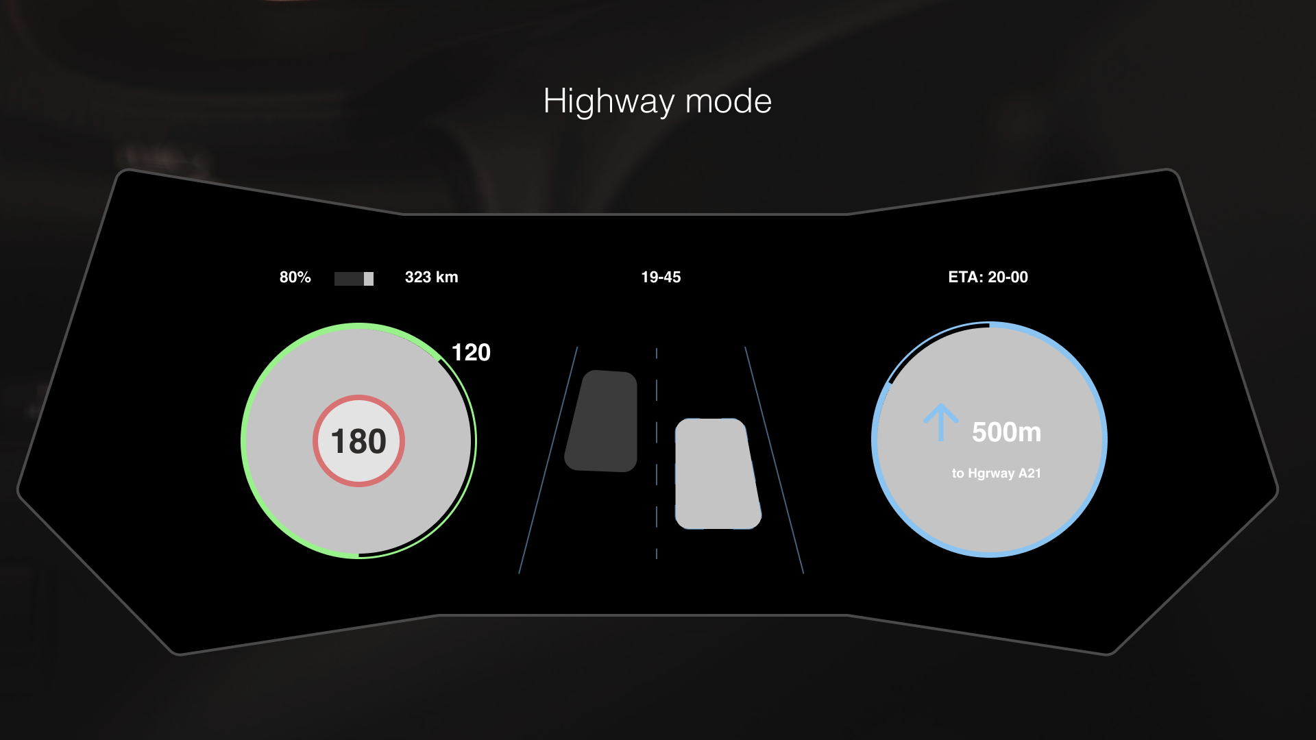
highway mode
Difference:
When driving on a highway, the instrument cluster only shows the utter necessary information to the driver to minimize driver's distraction.
On the left side, right in the center of the dial there is the speed limit allowed on the highway. The green line shows the current speed relatively to the speed limit because this is the most useful information when you're driving on a highway. When the green circle is fully complete, the driver is driving at exactly the speed limit. And the current speed is located next to the end of the green line.
The middle and right panel show the route and directions. When driving on a highway, showing a full map is too much information. The driver only needs to know which lane he needs to drive on and where to go next. Therefore, the middle space shows the position of the car on the road, the route the driver should follow and other cars on the road (that helps the user to drive safety in the another line and double checks the blind sports). The right dial acts as a progress bar for each direction. It gets adjusted for each new direction.
The area that filled around with the color shows how much of the route left to the final destination. ETA is the estimated time of arrival.
3d
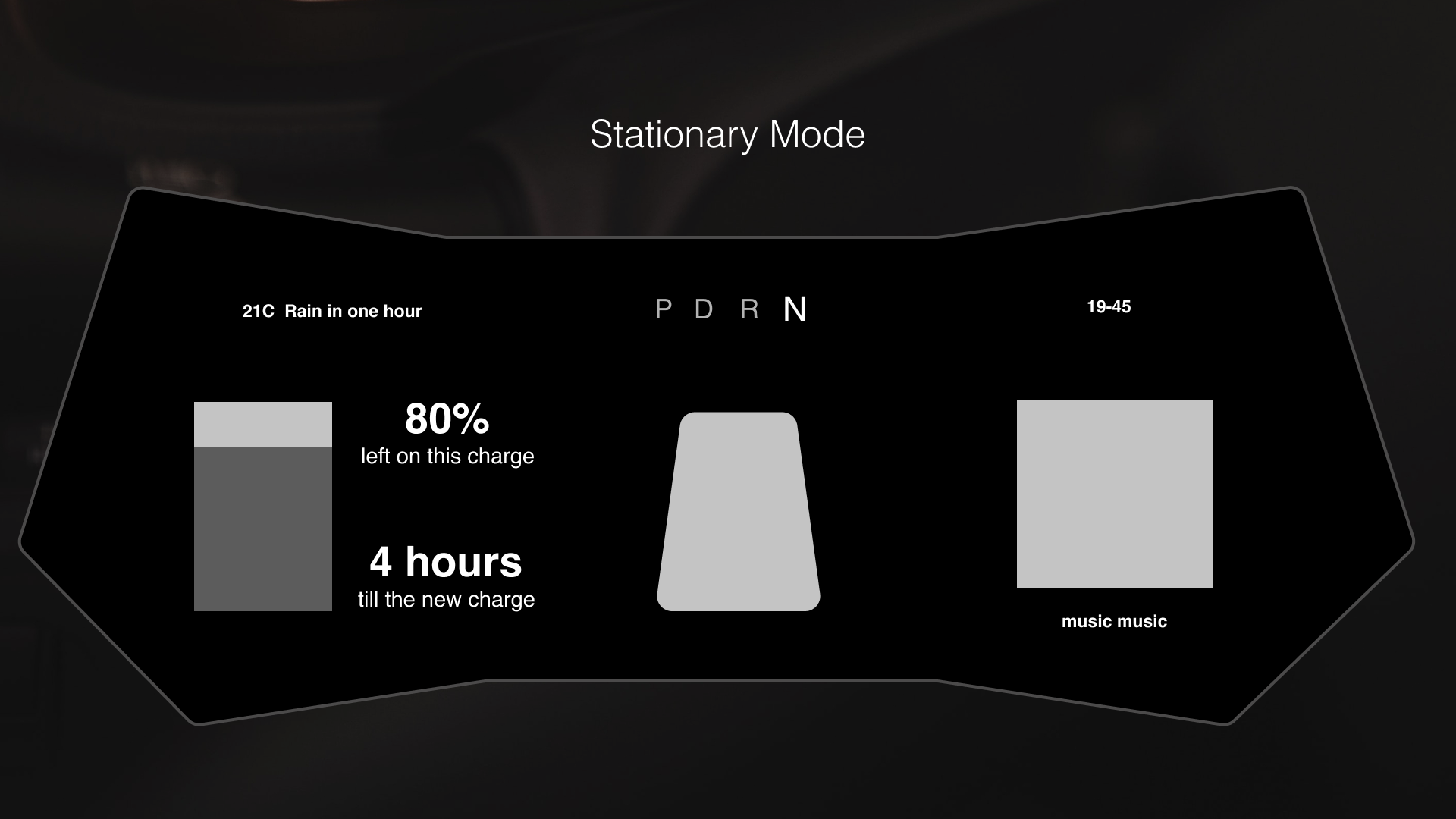
stationary mode
Difference:
If the car is in park or neutral, the UI provides very different information to the driver compared to the other driving modes.
The reason behind this is that the driver will be more interested in more detailed information. So for that, he will use the main infotainment system.
The left panel shows the charge level of the battery and the time till the next charge according to the last driving mode. The center panel shows a top view of the car that reflects the status of the car (open doors, lights, mechanical issues). The right panel shows the current media settings.
The information in the top bar also changes slightly as it shows more detailed information. The data is also displayed, as well as the weather and the weather prediction. The settings for the automatic gearbox are displayed in the center. And the current time.
4th
contact
! By the way I have a work permit in the Czech Republic
