ux/ui case study
Helping the Splitwise app improve the user experience in categorizing expenses and tracking payments in the app to increase adoption of the paid product
Description
During Memorisely’s UX/UI Bootcamp, I worked with my team partner Tara Barge to improve certain aspects of the Splitwise app. Over a period of 10 weeks, we went through the entire design process and focussed on making it easier for new users to increase the adoption of the paid product.
Problem
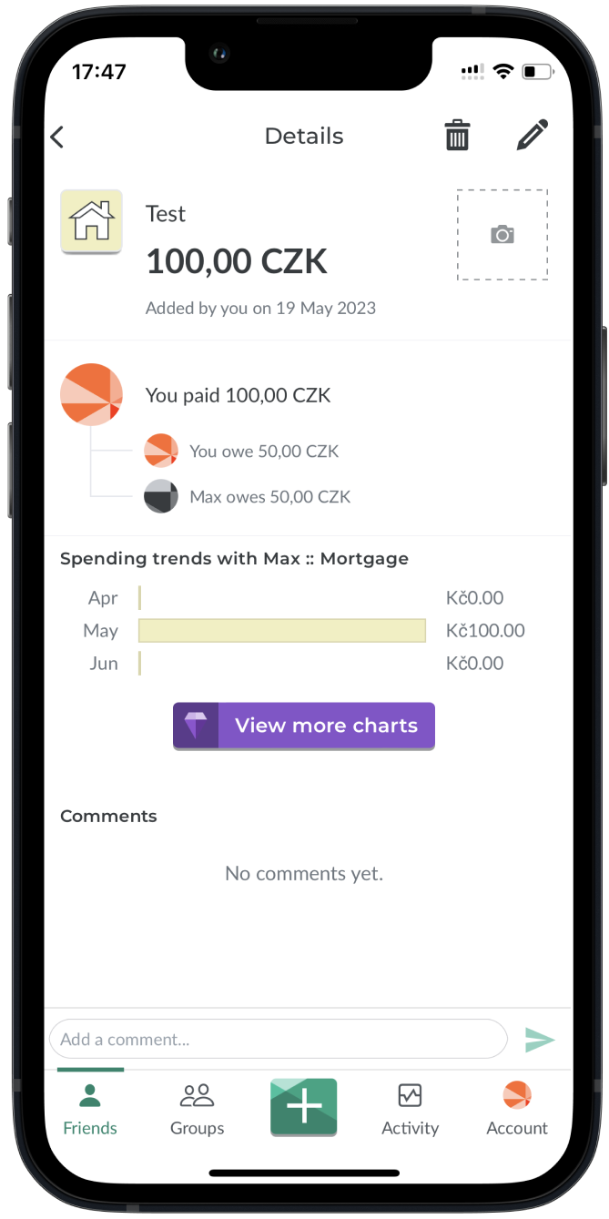
In the current version of the Splitwise app, users face a lack of clarity when it comes to categorizing their expenses and accurately visualizing who paid for what within a group. To enhance the expense-splitting experience, it is suggested to introduce expense categorization and improve the visual design, ensuring a clear representation of each individual’s contributions in a group setting.
Solution
Our solution mainly focused on enhancing the entire user journey for revenue sharing, right from the beginning to the end. We carefully considered both the business objective of promoting the paid version of the application and the user’s requirements to enable them to create personalized revenue-sharing categories.
Additionally, a redesign was undertaken to enhance the app's visual aspect, addressing the challenge of displaying each person's contributions clearly within group dynamics. Another objective behind the redesign was to craft a tone of voice that fosters a warm and amicable ambiance, allowing users to perceive the experience as akin to conversing with friends while seamlessly sharing expenses.
During Memorisely’s UX/UI Bootcamp, I worked with my team partner Tara Barge to improve certain aspects of the Splitwise app. Over a period of 10 weeks, we went through the entire design process and focussed on making it easier for new users to increase the adoption of the paid product.
Problem
In the current version of the Splitwise app, users face a lack of clarity when it comes to categorizing their expenses and accurately visualizing who paid for what within a group. To enhance the expense-splitting experience, it is suggested to introduce expense categorization and improve the visual design, ensuring a clear representation of each individual’s contributions in a group setting.
Solution
Our solution mainly focused on enhancing the entire user journey for revenue sharing, right from the beginning to the end. We carefully considered both the business objective of promoting the paid version of the application and the user’s requirements to enable them to create personalized revenue-sharing categories.
Additionally, a redesign was undertaken to enhance the app's visual aspect, addressing the challenge of displaying each person's contributions clearly within group dynamics. Another objective behind the redesign was to craft a tone of voice that fosters a warm and amicable ambiance, allowing users to perceive the experience as akin to conversing with friends while seamlessly sharing expenses.

BEFORE
AFTER
Role
Tools
Timeline
- User Research
- Product Strategy
- UI Design
- Interaction Design
- Usability Testing
- Figjam
- Notion
- Maze
- Figma
- 10 weeks
UI PART
1.Wireframes
4.Find illustrations
Lo-fidelity prototyping facilitates the rapid creation, editing, and visualization of how our screens interact with minimal design elements.
I utilized free resources like freepik.com to find illustrations that align with the UI style.
2.UI styles
5.Icons
3.References
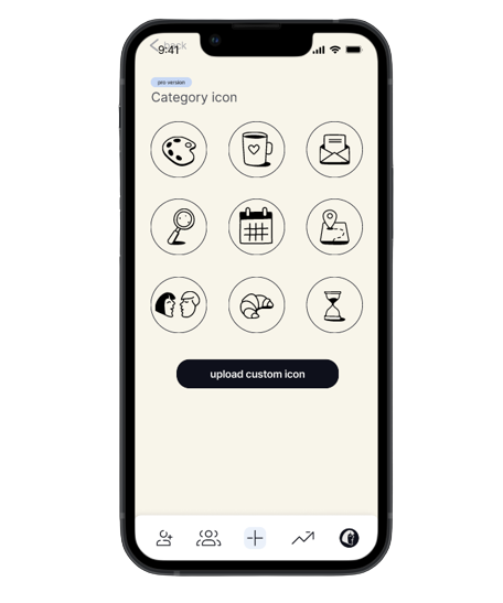
Exploring resources in the Figma community, I searched for hand-drawn icons that evoke a friendly user sentiment, conveying a collaborative and non-demanding atmosphere for seeking refunds or sharing expenses among friends without pressure or obligation.
By following the Atomic Design method, we were able to create an interactive component library.
One of the solutions I pursued was the development of a user-friendly UI to establish a sense of comfort for users when sharing expenses. To achieve this, I drew inspiration from references featuring hand-drawn illustrations.
6.Design
Using all prep work I started to make a design in Figma
the result
1 version
2 version
Styles & Components
By following the Atomic Design method, we were able to create an interactive component library, utilizing component properties to streamline our workflow and facilitate the development of reusable and adaptable elements.
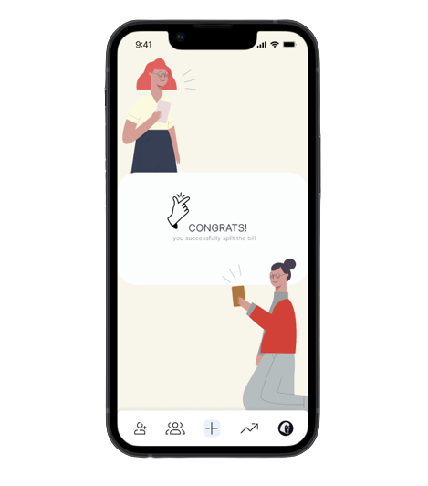
In terms of UI design, our tone of voice aims to establish a friendly atmosphere, ensuring users feel as though they are chatting with friends while effortlessly splitting expenses. The primary color palette centers around a soft yellow tone, contributing to the overall warmth of the design.
To guide users effectively, we incorporated hand-drawn icons and illustrations, leading them toward their end goal. For text, we chose the Inter typeface, as it enhances the readability of mixed-case and lower-case text.
Consistency in spacing was achieved by using a 4-column grid on mobile, ensuring content remains evenly spaced. Additionally, a 4px grid system was adopted to maintain a cohesive spacing rule throughout the interface.
UX PART
Usability Review
In our survey, we incorporated both open-ended and close-ended questions, and the target audience was an integral part of the process.
Using Dovetail, we summarized all the responses and structured them under relevant tags (tagging taxonomy).
The last step involved identifying trends, which were then consolidated into the affinity map.
To gain a comprehensive understanding of the product and empathize with the users, we conducted a usability review focused on analyzing the pain points and moments of delight in the process of splitting expenses.
phase 1
Business & User Frustrations
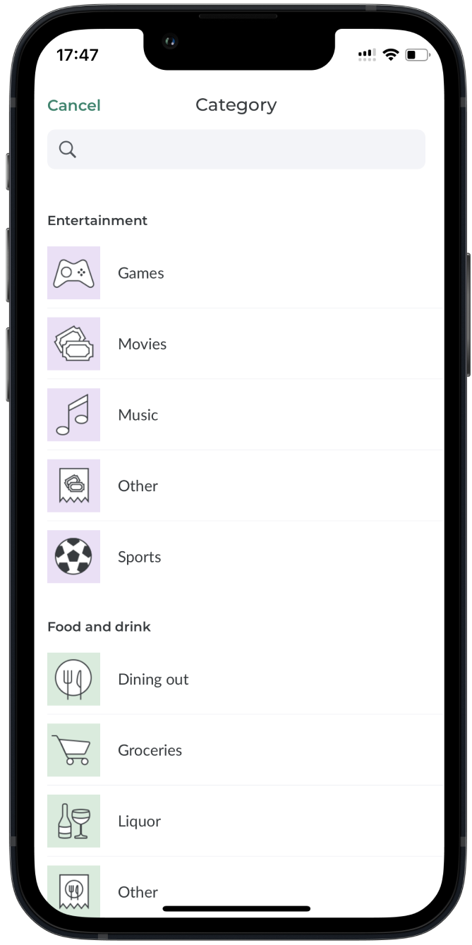
In the initial version of the application, users were restricted to choosing a category for splitting expenses solely from the pre-defined list. Unfortunately, this limitation prevented them from adding custom categories per their needs.
During the expense splitting stage, the user experiences frustration and confusion because they don’t understand how to adjust the bill amount and divide it unequally.
phase 2
// Secondary Frustration
// primary Frustration
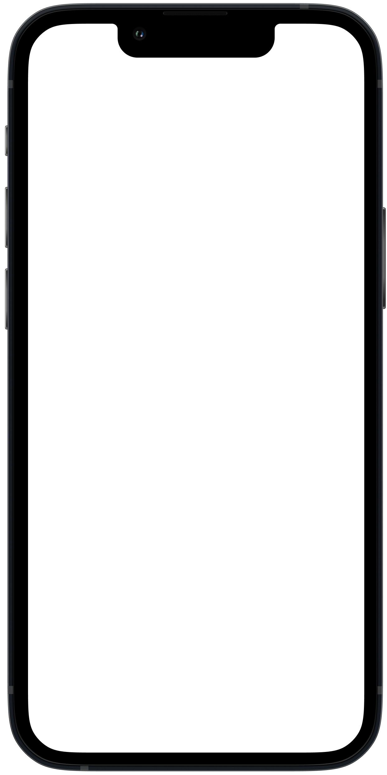
Competitor Benchmarking
By analyzing our direct and indirect competitors, we can gain valuable insights into the similarities and distinctions between our product and theirs. This process allows us to understand better the application market and how users interact with various products.
phase 3
Problem Space
The problem space allows us to concentrate our solution efforts on the users directly impacted by the issue. In this instance, it pertains to users who wish to edit their custom category.
After conducting a usability review, competitor benchmarking, and additional research, we can pinpoint their specific problem. Asking questions helps us empathize with these users.
Using this problem space, we created "how might we" statements as a foundation for iteratively developing initial solutions.
phase 4
// One such statement is:
"How might we simplify the process for new users to add their custom category when splitting expenses with friends?"
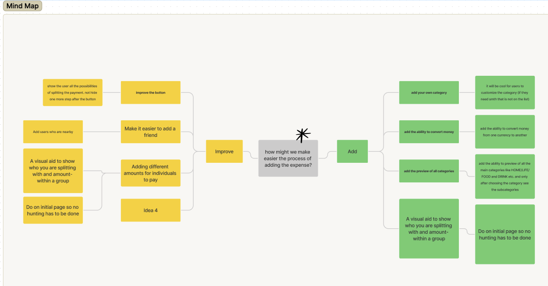
Ideation
In our quest for more ideas, we engaged in the ideation process, starting with the creation of a mind map to identify areas for improvement and potential additions.
Subsequently, we conducted a "crazy 8s" session to generate unconventional ideas and visually express the concepts we had written down. This approach allowed us to explore a broader range of creative possibilities.
Subsequently, we conducted a "crazy 8s" session to generate unconventional ideas and visually express the concepts we had written down. This approach allowed us to explore a broader range of creative possibilities.
phase 5
// What can we add?
// What can we improve?
- Allow users to add their custom categories, enabling them to personalize their expense tracking experience beyond the provided list.
- Implement a preview feature for all main categories (e.g., HOME, LIFE, FOOD, DRINK) before choosing, and then reveal the subcategories, streamlining the selection process.
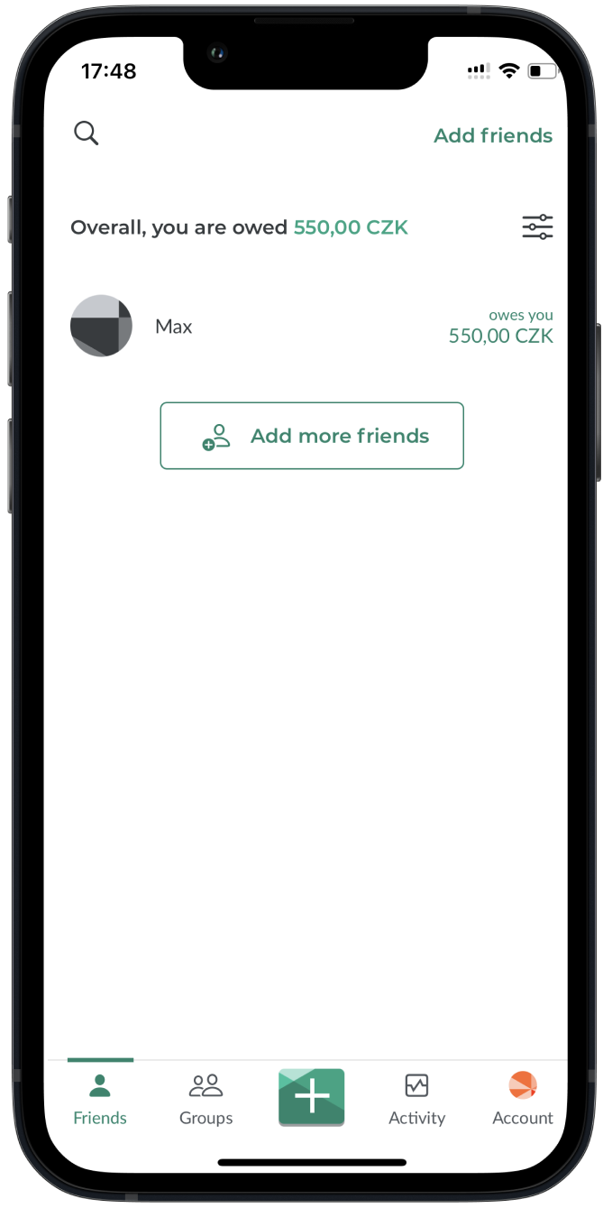
- Provide a visual aid on the initial page to clearly show with whom users are splitting expenses within a group, along with the corresponding amounts, eliminating the need for users to search for this information.
- Enhance the button functionality to display all available payment-splitting options upfront, avoiding the need for an additional step after clicking the button.
- Simplify the process of adding friends, making it more user-friendly and accessible to ensure a smoother user experience.
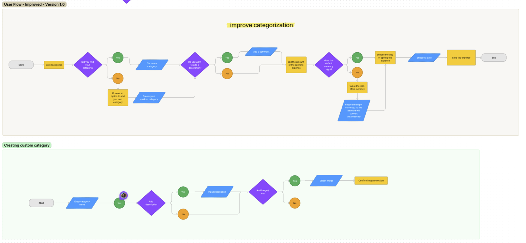
User Flows
Following the ideation phase, we developed a user flow diagram that depicted the existing experience and incorporated our earlier conceptualized ideas into an improved version. This enabled us to gain a comprehensive understanding of the wireframes required and identify the necessary steps users would follow while splitting expenses using the paid version of the app.
phase 6
High Fidelity Prototype
In contrast to our low-fidelity prototypes, our high-fidelity prototype aims to establish a definitive standard for our design workflow.
Our objective is to achieve pixel-perfection in every design, ensuring that when we hand them over to developers, the conversion of our designs into code is smooth and seamless.
Our objective is to achieve pixel-perfection in every design, ensuring that when we hand them over to developers, the conversion of our designs into code is smooth and seamless.
phase 9
contact
! By the way I have a work permit in the Czech Republic
